
Picking out coordinating outfits for portraits can feel overwhelming so I’ve pulled together some tips to help you think through your desired look and feel of your shoot.
These choices represent the three main decisions you will have to make in regards to your outfit choices. There are no right or wrong answers! What style do you prefer?
- Bold or neutral
- Dressy or casual
- Classic or trendy
Maybe you want one outfit to be dressy and the other to be casual. Maybe you want one outfit to be very light and neutral then wear more color in the next outfit. These categories will hopefully help you determine what you want out of your session. If you’re feeling stuck and can’t seem to determine what you prefer, that’s very normal!
Here are some general guidelines when it comes to styling a session. Once you read through these, you may have a better understanding of what you prefer and you can start planning your outfits. These guides are based off of my experience and aren’t concrete rules. However, if you have questions about one of them in regards to what you want to wear, just email me and we can talk about what would be best!
Considerations
- Some colors create color casts: I recommend avoiding bright reds, neons, and bright oranges. They reflect color onto skin and can be difficult to edit.
- Patterns smaller than a quarter: Stay away from tiny patterns which can cause something called “chromatic aberration” in digital images. Men’s checkered shirts are fine if the “checks” are on the larger side.
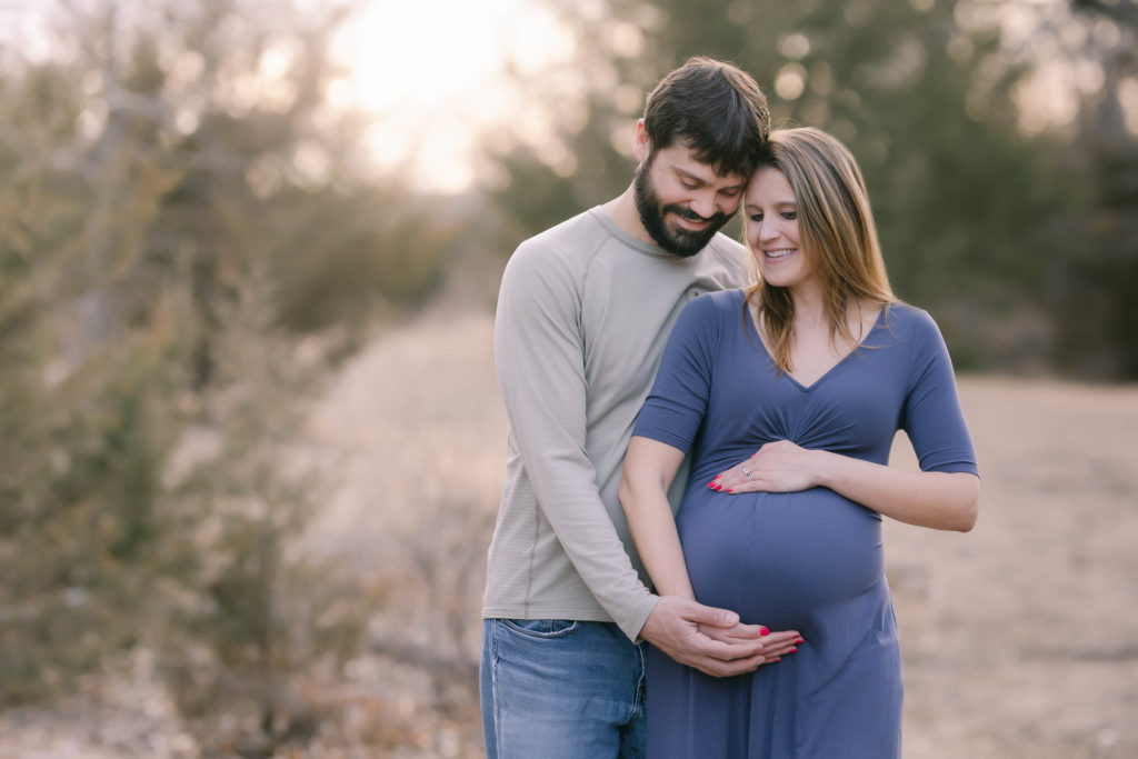
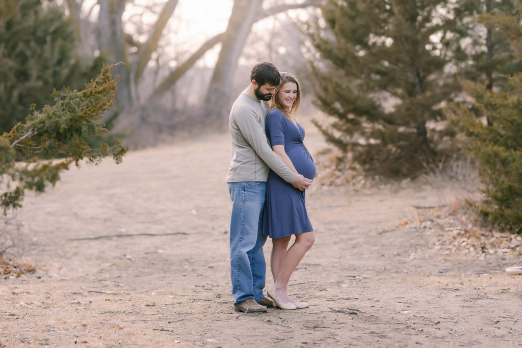
- Alternate heaviness: If one of you is wearing very dark jeans, the other may want to wear lighter pants. If one person wears a navy top, the other should consider a lighter color top. To a certain degree, alternating the “heaviness” of your outfits can make your images look more balanced and dynamic.
- Keep your styles consistent: If one person is dressy while another is wearing a casual outfit, it can look odd in photos. Stay aligned in your outfit selections.
- Other items I suggest avoiding: Tennis shoes, graphic tees, bold logos on shirts, sunglasses and baseball hats.
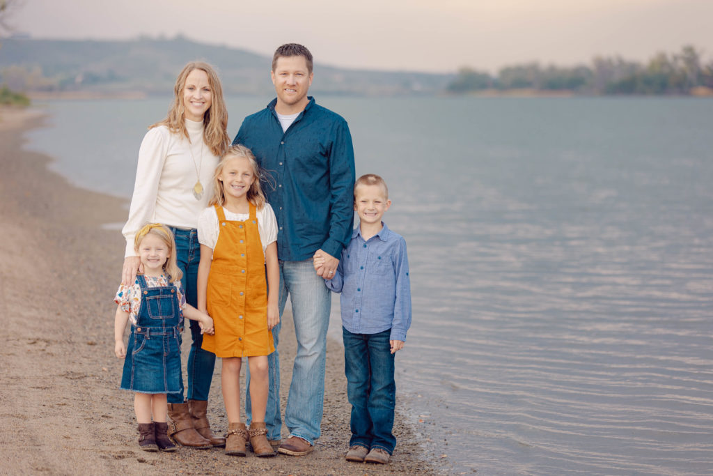
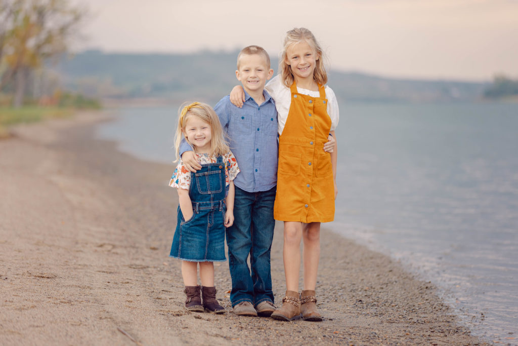
Choose your color palette
In another post I covered some common styling myths. One suggestion you may hear is to pick one color and have everyone match. Instead, I would recommend you choose a color palette. Much like designing your home color scheme, selecting an array of coordinating colors will give your wardrobe flexibility and allow each member of the family to stay true to themselves.
Below are two style examples I recommend and tips to create each look.
Light and airy
If you’re hoping for a more light and airy style of shoot that includes light and airy colors, you can actually make outfit choices that will lend your images to turn out brighter, softer and extra photogenic!
Here are some ingredients that go into creating a light and airy styled shoot. It’s important to note that you do not need to choose all of these ingredients in order to create this style in your images, yet the more ingredients you include, the more light and airy it will be:
- Neutral colors: Blushes, tans, light pinks, faint blues and light minty teals, creams, grays and whites will always result in more of a light and airy look in your images. These colors photograph softer.
- Long, flowing skirts and dresses: Dresses and skirts with feminine ruffles, multiple layers of fabric and the ability to blow and move in the wind will always photograph beautifully! You would be amazed at how impactful moving fabric softens an image.
- Khakis vs. jeans: If you really want your images to be as bright as possible, consider having your guy wear lighter pants instead of dark dress pants or dark jeans.
Bright and bold
Just like the light and airy recipe, you don’t have to apply all of these elements to get a perfectly bright and bold look to your session. These ingredients include:
- Only one wears a pattern: If one of you has a bold pattern, it’s important that the other outfits don’t. The more bold the pattern, the more important this rule is. I recommend you create your color palette from the colors found in the pattern.
- Pick one or two bold colors: If you really want a bold and bright look and you want to do it tastefully, for couples I suggest only one of you have a bright and bold colored outfit and the other stay in a solid neutral to avoid over-doing it. With family groups, you can pick up to two bold colors and balance with neutrals.
- Large Patterns are Preferred: If you want to wear a pattern, pick a pattern on the larger side. Patterns that are smaller than a quarter can be difficult to photograph. This isn’t true of all patterns but it’s a good general rule to go by!
I’m here to help! Let’s Chat.
If you’re interested in a session, we’ll set up a planning meeting to discuss your home style, your vision for your family portraits, and plan your wardrobe so your images will display in your home as works of art.
I would love to create cherished family portraits for you. Contact me and we’ll start planning!


comments +